


For me, myWindsock is a vital planning tool. It’s key for races, and for planning longer rides where a negative split is The Way. And it’s just gotten easier to visualize the windpact with their wind-as-elevation chart. Love it!
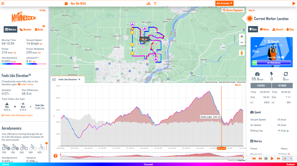
The chart shows the real road feel when the Wind and Elevation are combined. There is no better way to visualise a ride, so it is now the default chart for all your Strava Activities and Routes you view at myWindsock.com.
I believe cyclists should have access to Weather data just like, elevation, speed and power. Riding the same route on two different days, will give you two different experiences. We should be quantifying that.
Learn more about Feels Like Elevation™
Kind regards,
BenFounder
myWindsock